


Interior
Corporate branding
Every taste deserves a sketch, every interior an honourable bow. With that mindset, interior design agency reverence always strives for high-end realisations of commercial and residential projects. The complementary team does so through progressive concepts, disciplined follow-up and top-notch execution. To bring the reverence brand to that same level and further differentiate it, MOQO set out a new framework.
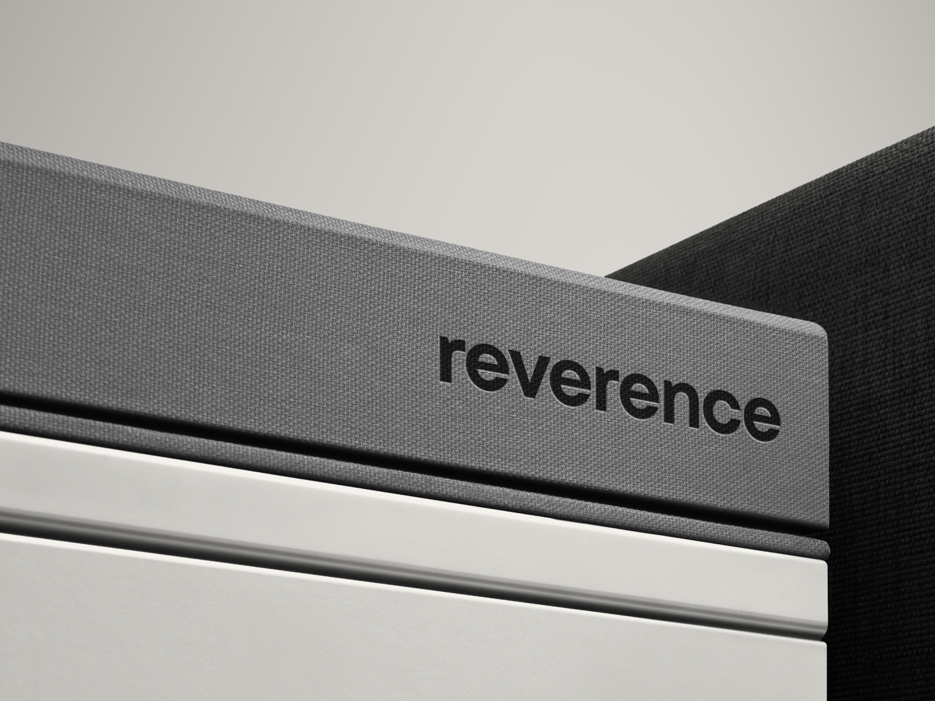
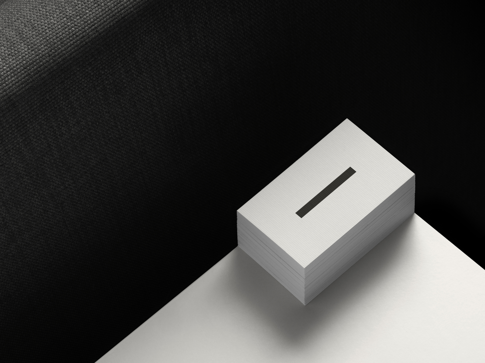
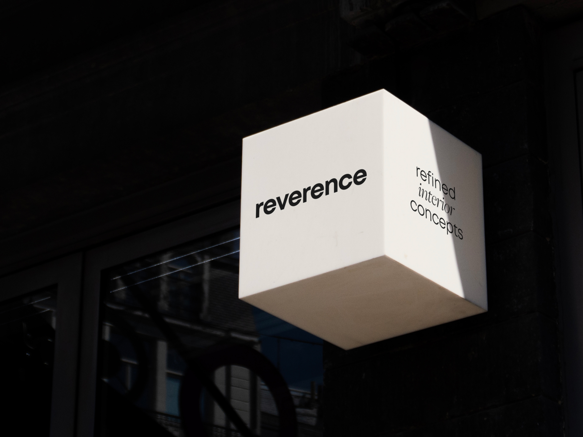
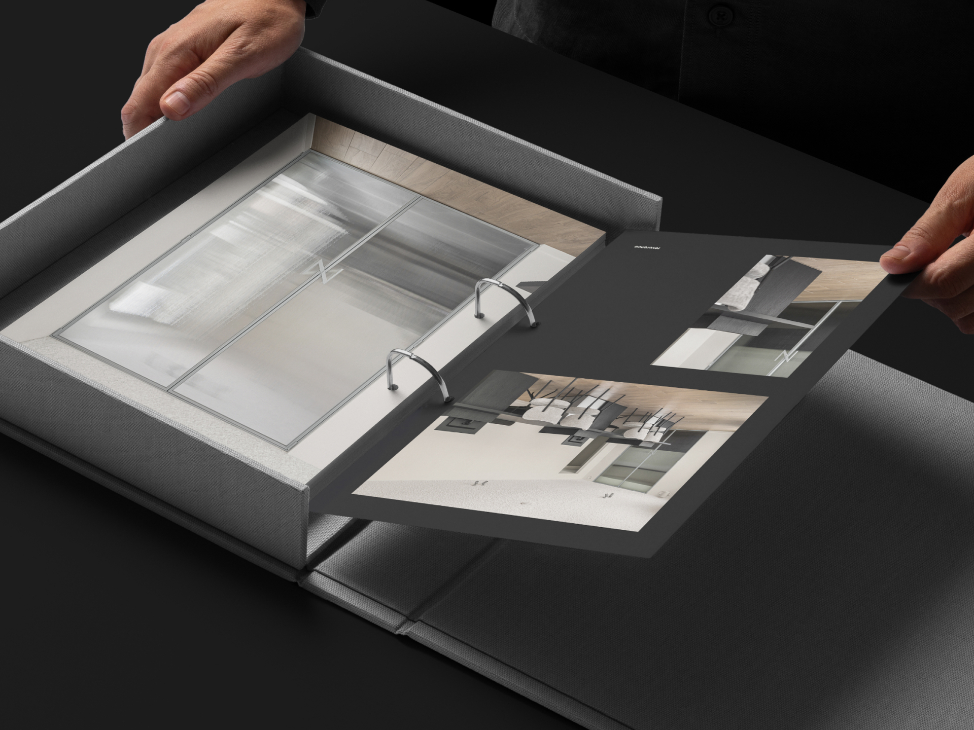
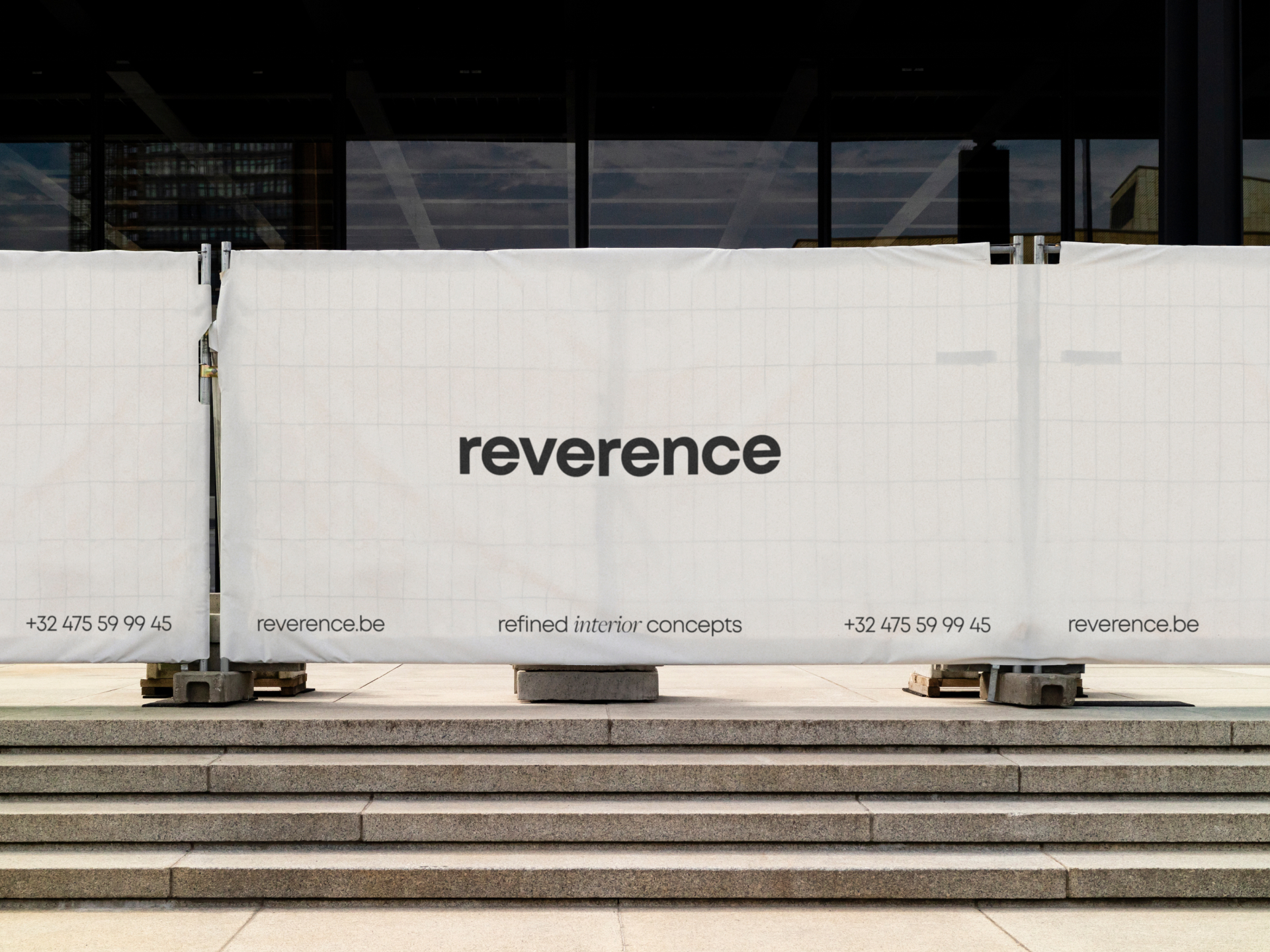
The respectful vision and personal connection that characterise this interior design agency is reflected in its verbal identity. For instance, tagline ‘refined interior concepts’ makes clear how respect for the concept produces a high-quality realisation. The same mindset is visible in the visual identity, where minimalism highlights refinement. The logo evolved and now possesses an extra dimension, thanks to the graphic bar that outlines it. Furthermore, the visual recognisability is enhanced thanks to the ribbed glass effect on the photography, reflecting the attention to materialisation.
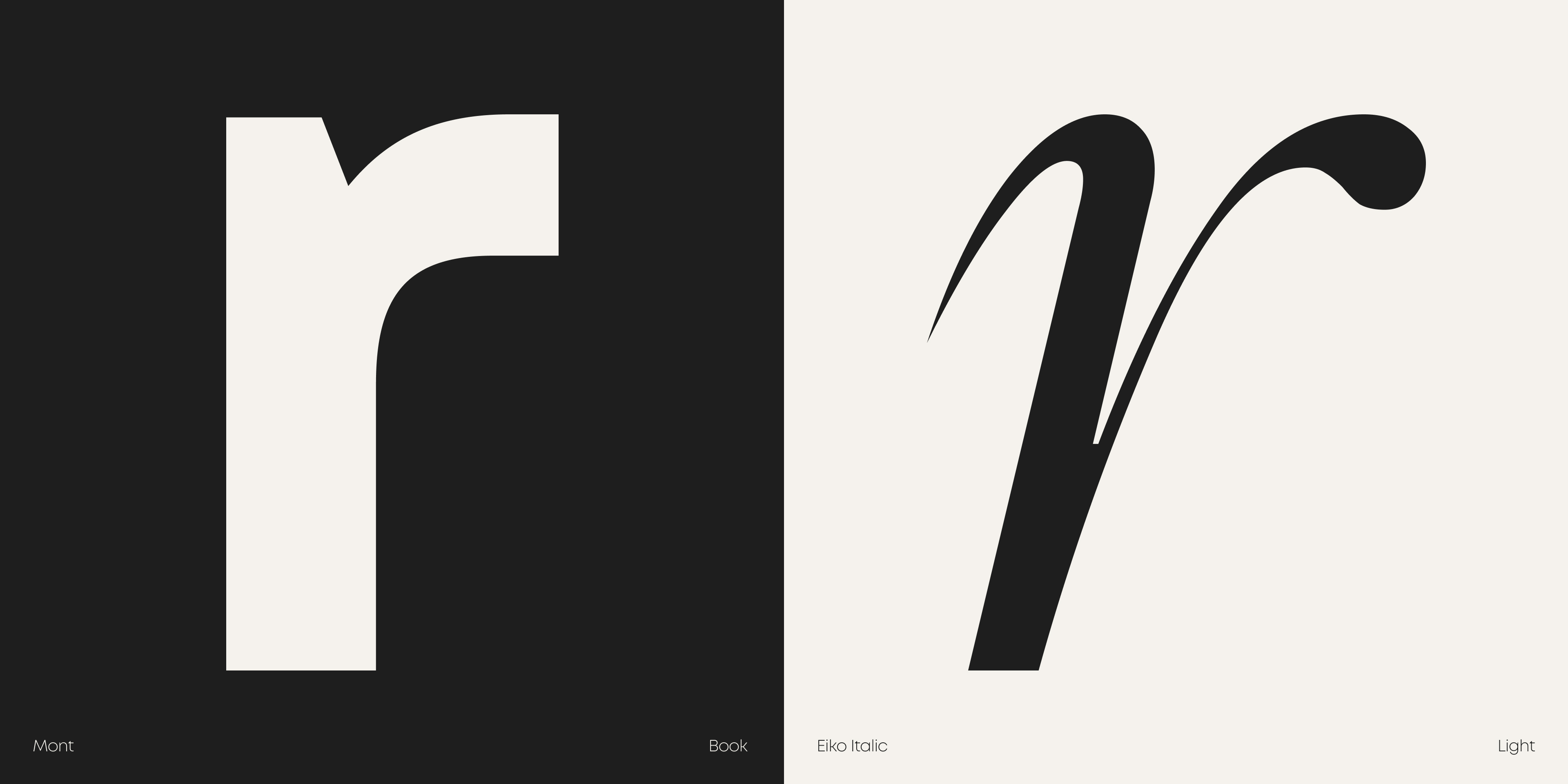
Two contrasting fonts, a geometric sans serif and an italic serif, bring a sense of dynamism to the interior design agency's messages. With a darker grey and warmer white, we find the same contrast in the colour palette. In addition, the entire picture bears the stamp of a motion-first identity. Thus, animations further enliven the logo, photography and graphic elements. Reflect on this case and discover how our rebranding lives up to the reverence essence.
LET’S HAVE A TALK.
WE’RE EAGER TO GET TO KNOW YOU
AND YOUR STORY.
