

Architecture
Corporate branding
Meet pylyser, the unfolding architectural project of Evy Pylyser. With a thoughtful vision of context and space, she translates her ideas into a distinctly brutalist style with soft touches. It was up to MOQO to draw out a pure branding.
Pylyser is a name that sounds powerful, rhythmic, mysterious and to the point. The baseline 'Shaping Life' perfectly captures what pylyser is all about: creating memorable designs, inspiring people and giving them all the space they need to develop themselves fully. Because to create is to shape life.
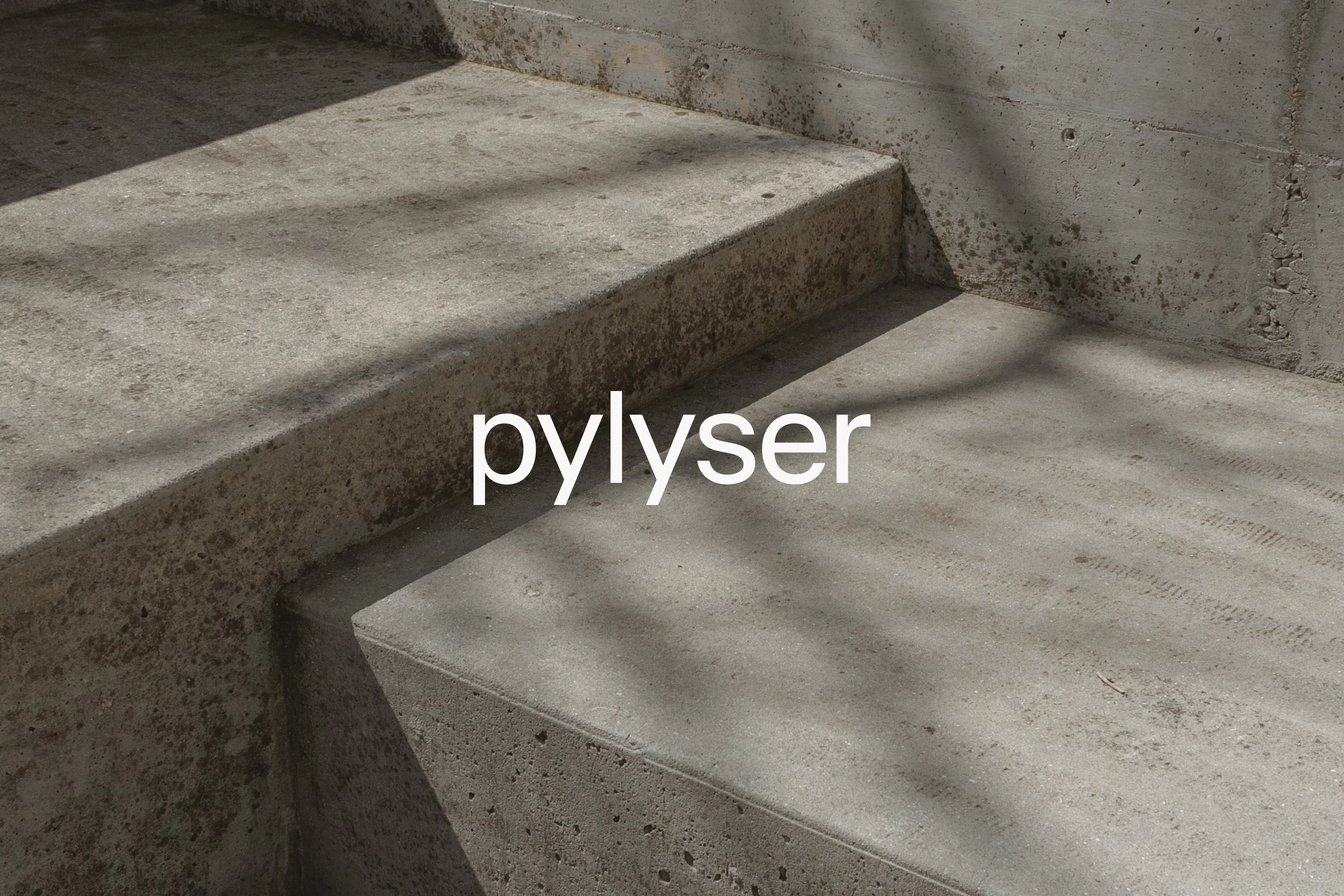
The logo shows the name in lowercase in a geometric font, for a stylish and modern high-end feel. Throughout the visual identity, warm concrete tints provide a subtle use of colour. Furthermore, shapes from technical drawings are stylised and simplified to give a brutalistic and distinctive nod.
The minimalist website gives room to the visitor and intriguingly puts the work centre stage. On social media, attention is drawn to detail shots of versatile designs and realisations, and distinctive materials and textures. That same dedication to look and feel is reflected in the business cards, where a print-through makes the name tangible. A stylish portrait in an architectural setting shows Evy as the driving force behind the name 'pylyser' and provides a personal touch to the uniform whole.
This branding provides pylyser with a stylish basis for an inspiring future.
LET’S HAVE A TALK.
WE’RE EAGER TO GET TO KNOW YOU
AND YOUR STORY.