


Food
Corporate branding
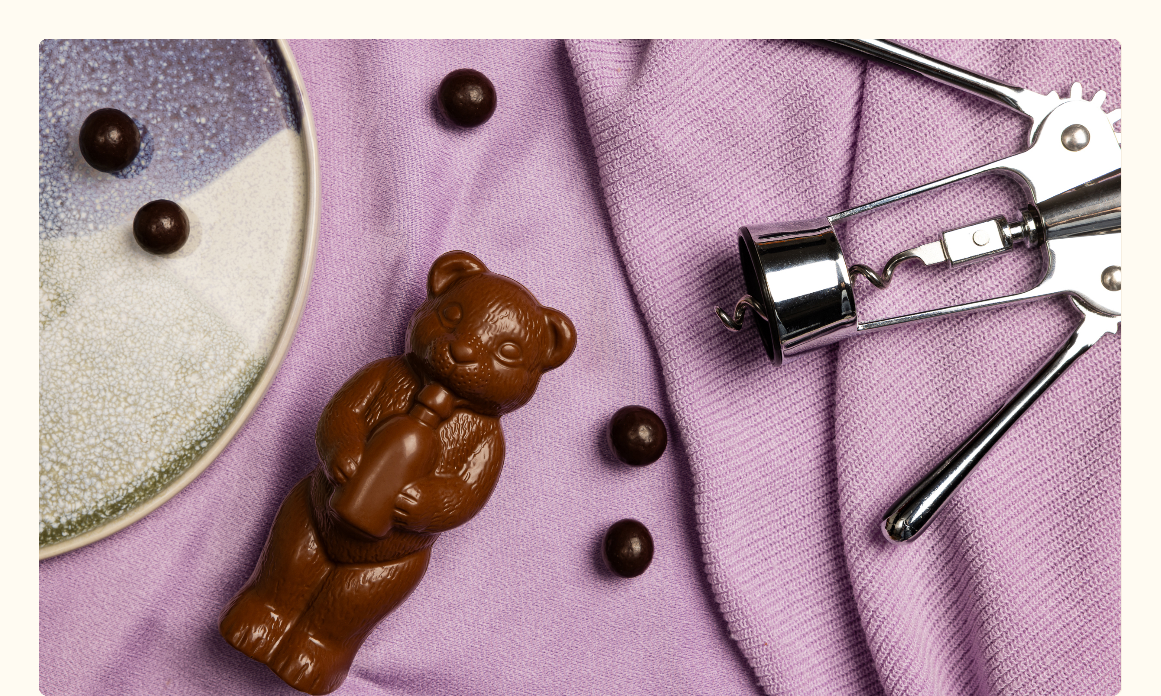
From the chocolate eggs hidden in the garden to the chocolate heart received as a Valentine’s present: for many of us, hollow figures trigger fond memories. This nostalgia shapes the rebranding of Chocolaterie De Schutter, a specialist in hollow chocolate goods for all seasons. After a takeover, the new owners wanted to freshen up the brand, so our team was happy to immerse itself in the world of white, milk and fondant.
We seal the brand story around chocolate as a source of moments of happiness with the baseline ‘chocolate to cherish’. It is given a prominent place under the new logo: with its artisanal font and subtle hollowing out clearly inspired by the tradition of hollow goods. The main colours – a warm orange and a calm cream – melt together with a seasonal colour palette, which gives each category within the product range an identity.
We take creative flatlay photos per season and, to better highlight the fine quality of the chocolate, modernise all product shots. They end up in an extensive catalogue and on the website of Chocolaterie De Schutter, which brings the brand to life in a dynamic way.
LET’S HAVE A TALK.
WE’RE EAGER TO GET TO KNOW YOU
AND YOUR STORY.
