



Transport
Corporate branding
De Buf started building trucks in 1988 and later expanded by developing its own concrete mixer. Meanwhile, the second generation is ready to continue Frits De Buf's life's work. To prepare the company for its international ambitions, a clear brand architecture, brand positioning and accompanying rebranding imposed itself.
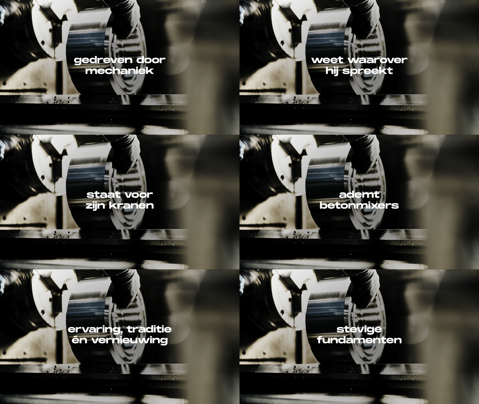
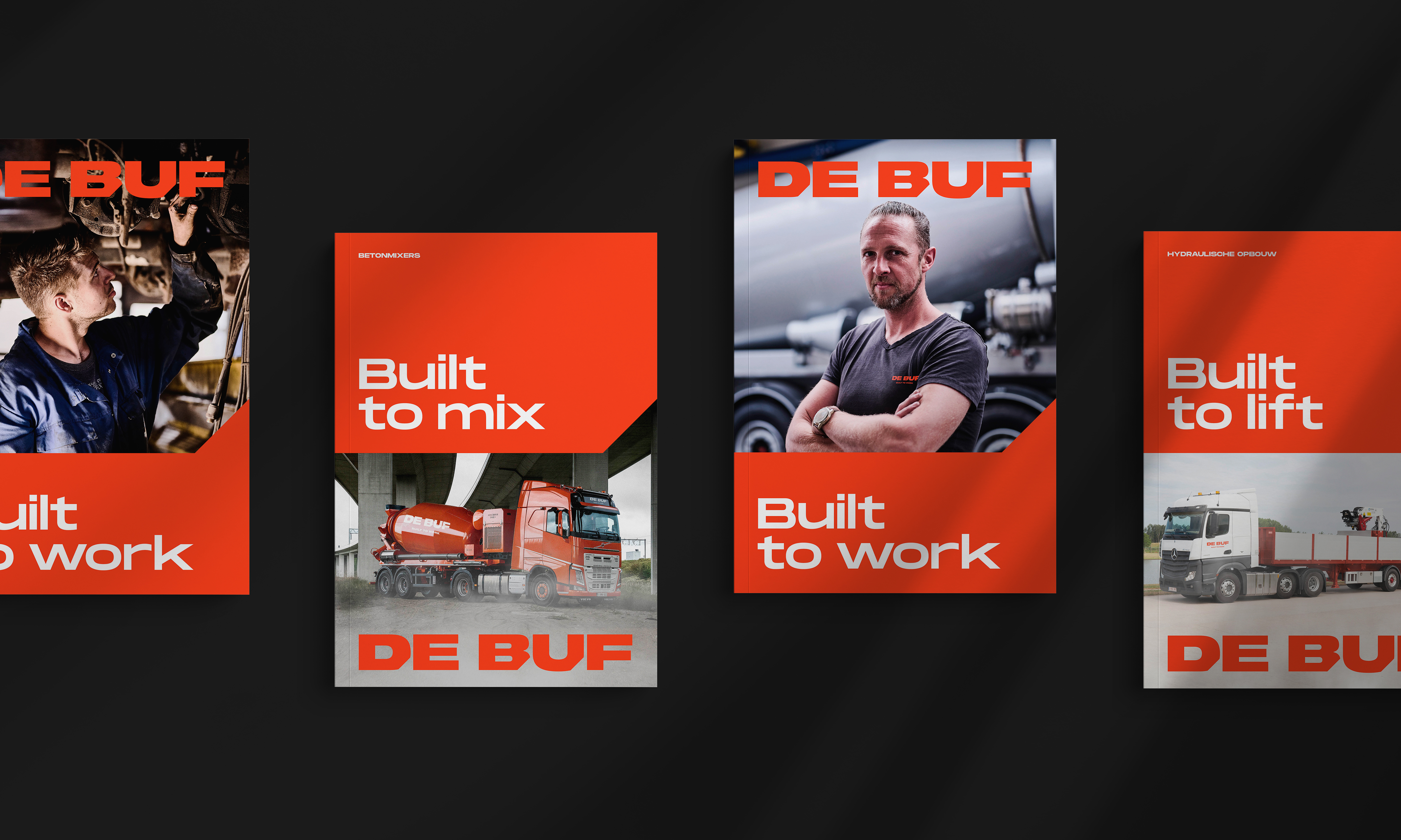
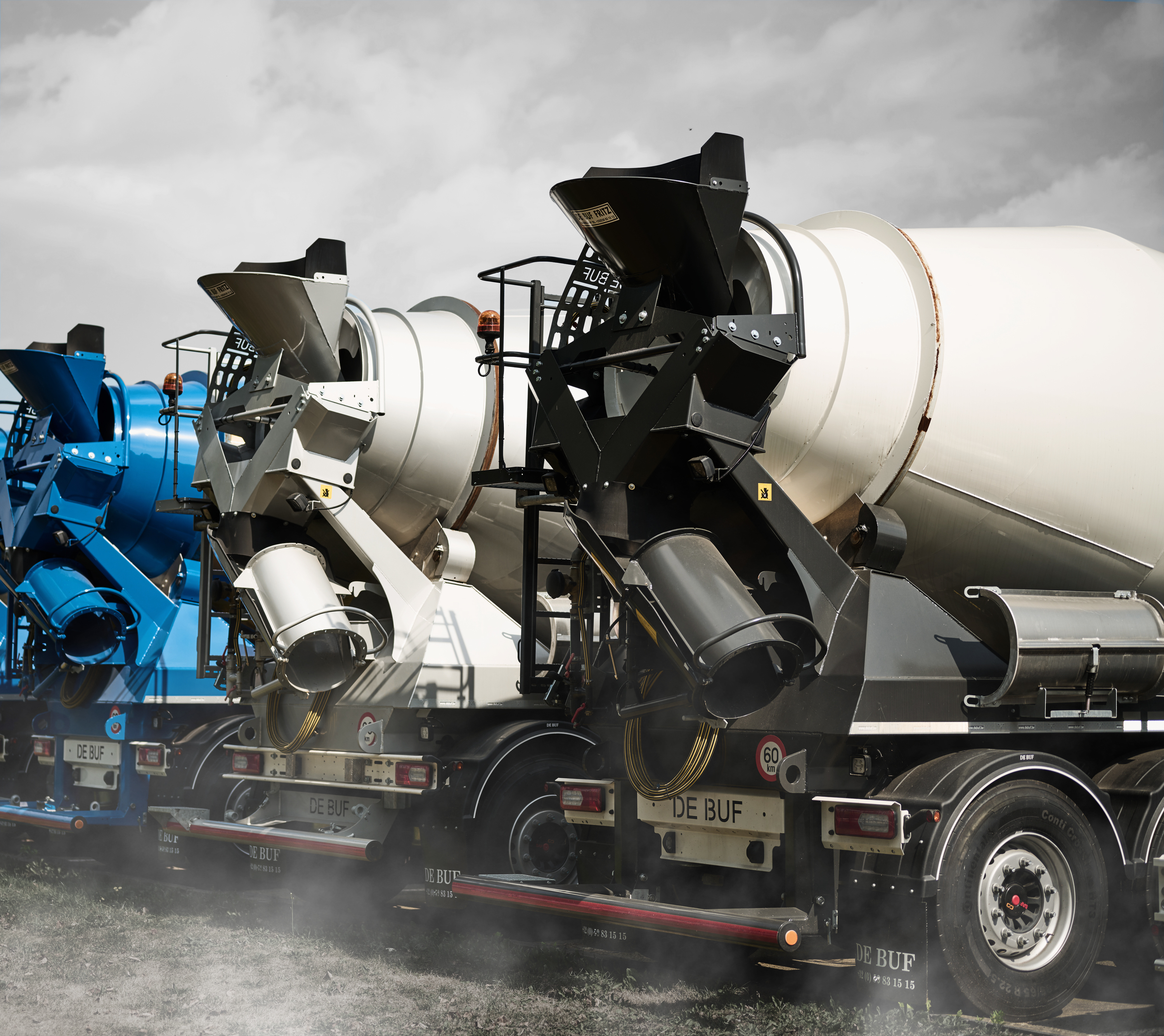
Preliminary research showed that the industry in question is one of few words. This was again confirmed during the brand intake session, as well as De Buf's pride its self-developed concrete mixer. To warm up (inter)national clientele to De Buf, we position the family business as a solid, experienced player with a direct approach. We put their concrete mixer at the centre and personified the product accordingly: in the brand story, a concrete mixer simply becomes a De Buf.
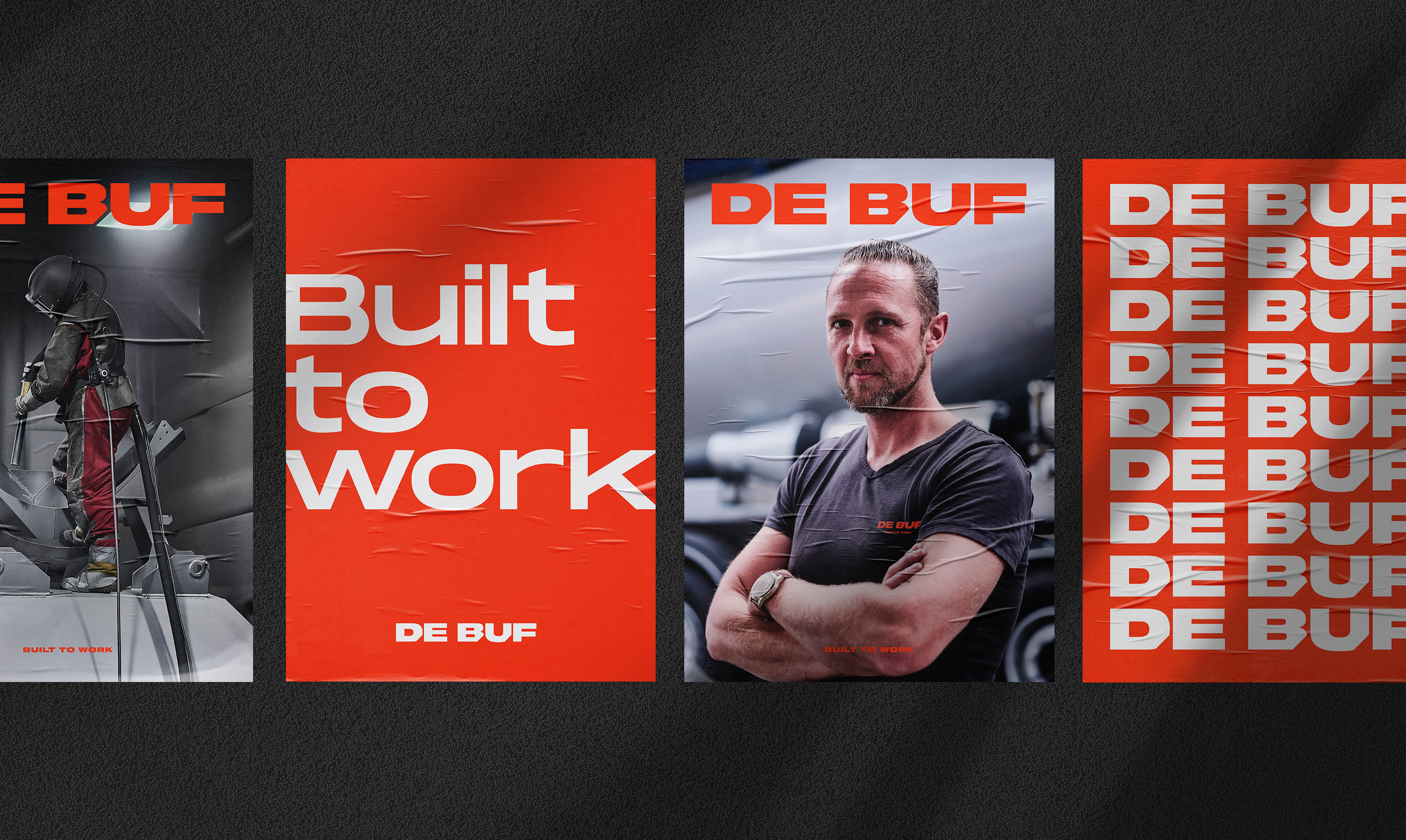
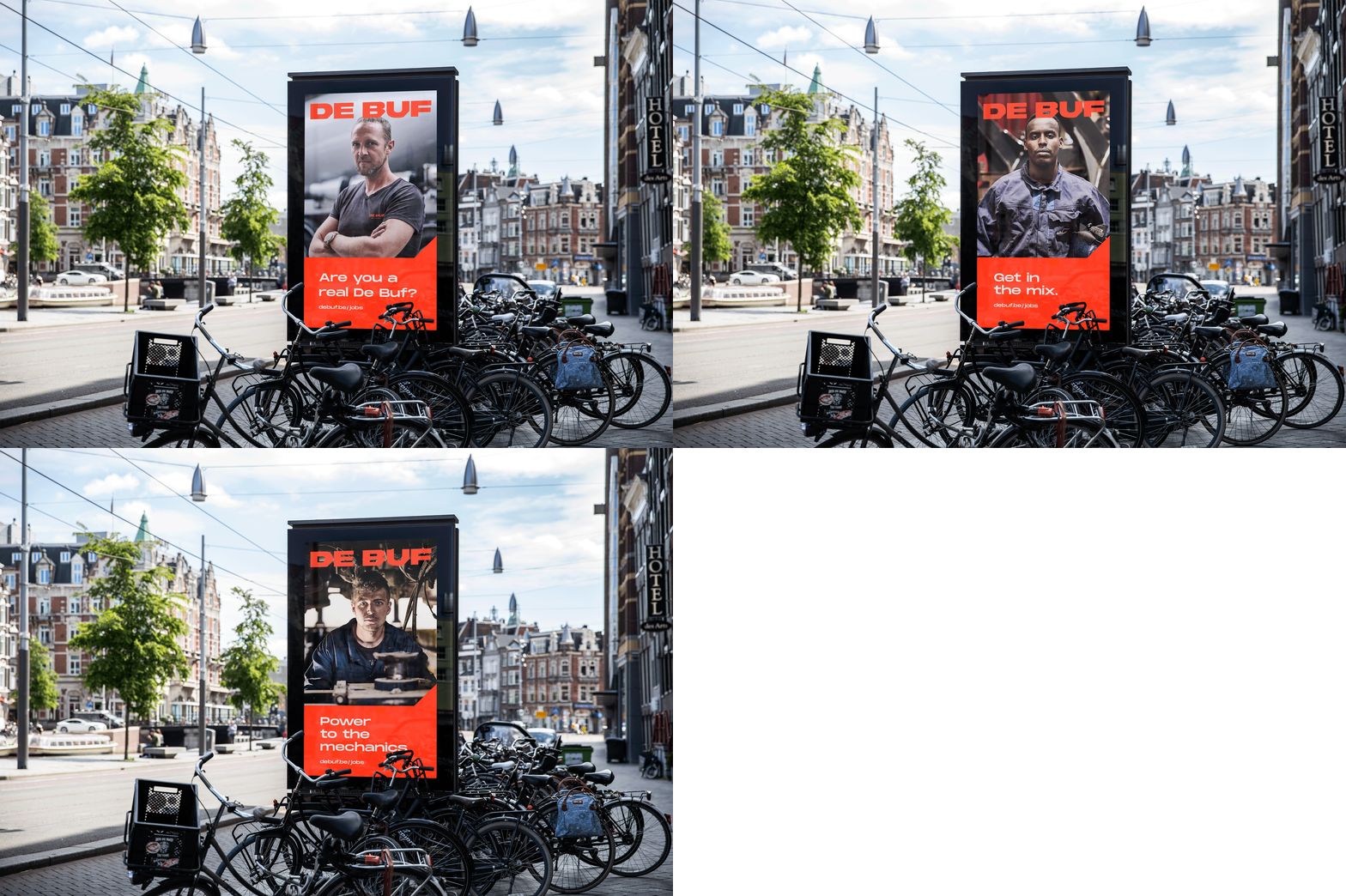
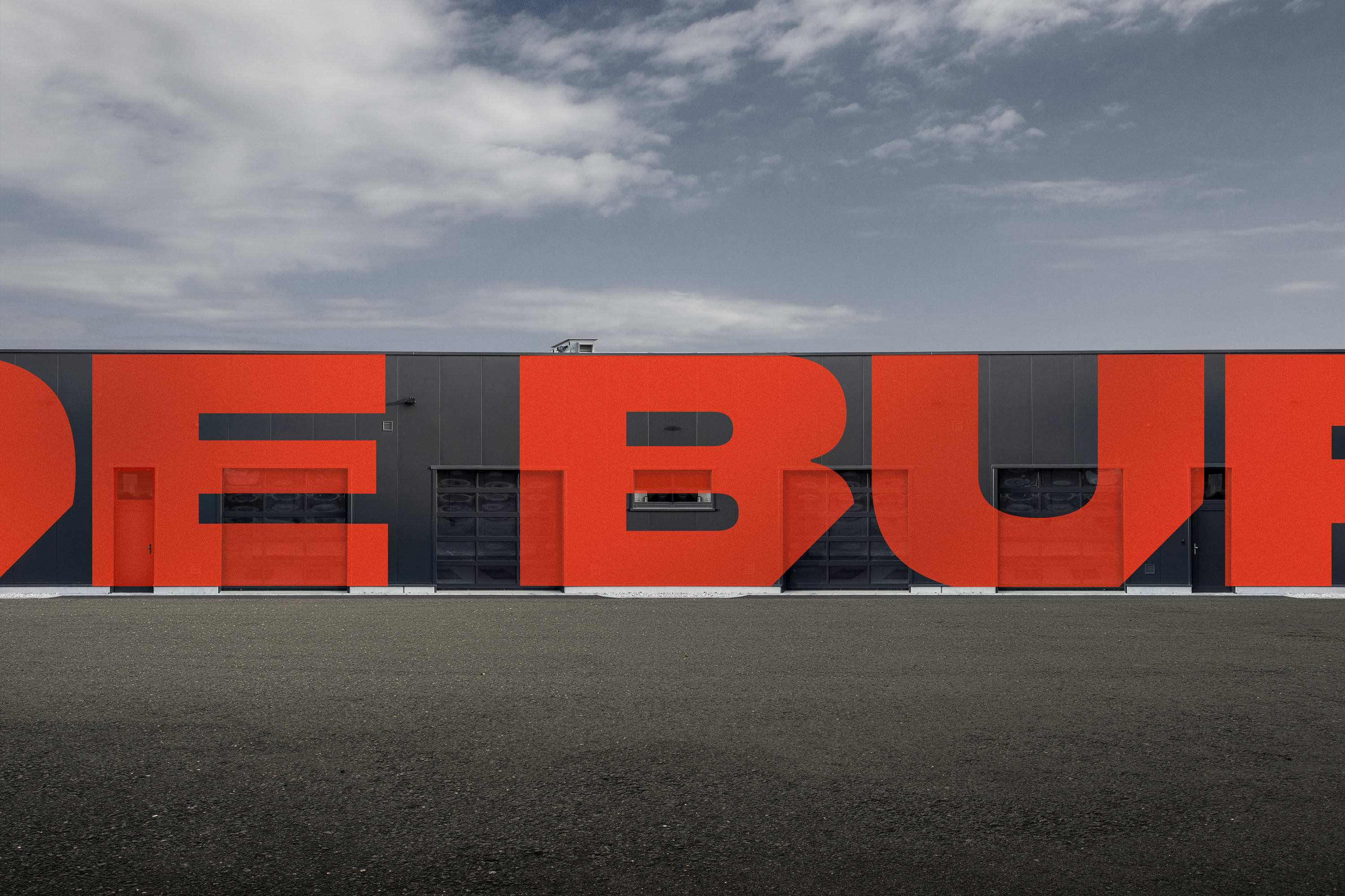
In the visual identity we applied the concept of 'bigger is more'. De Buf stands out, both in terms of product and service, and we emphasise this by placing the logo at maximum size throughout. We made the existing orange corporate identity colour slightly more fiery red so that the target audience would associate the brand with its passion and directness. The corporate photography looks rough and tough, both in colour and composition, while angled surfaces exude technicality and give the brand a recognisable character.
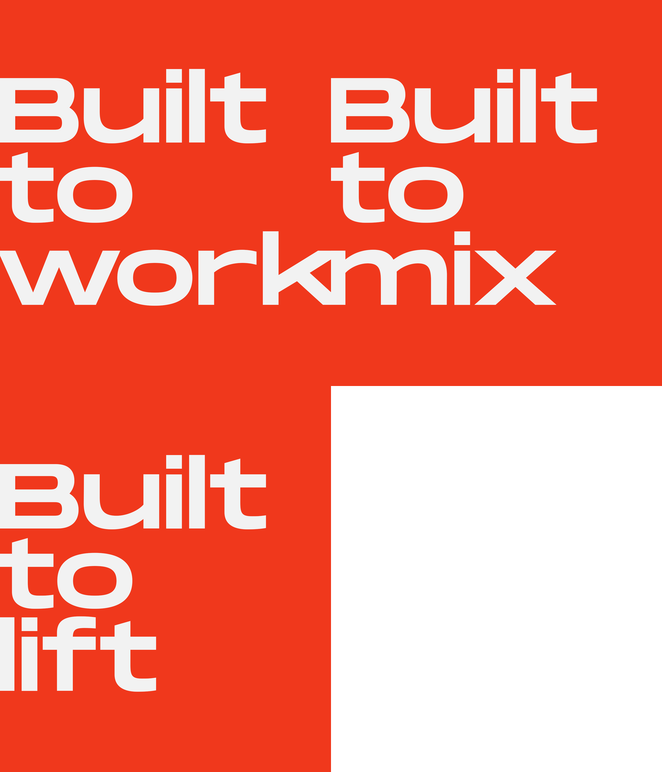
With its concrete mixers, which are made entirely in-house, De Buf focuses on a specific target group. Using the dynamic taglines 'built to lift' and 'built to mix', we enable a targeted customer. In addition to a new website, we make every possible medium available to the client to further communicate about its products (inter)nationally, both online and offline. As a full-service partner, MOQO remains available and monitors the brand line.


LET’S HAVE A TALK.
WE’RE EAGER TO GET TO KNOW YOU
AND YOUR STORY.